Colour Theory Basics for Street Photography

After a week or so of procrastination, I’ve finally sat down to write something. I’ve paused my current YouTube video — “Most Pathetic David Brent Moments | The Office” — just long enough to scribble a paragraph or two before my tea’s ready. Just another Thursday.
I’ve been thinking on and off this week about what to write for this week’s blog, and… nothing. Tumbleweed. Like Kurt Cobain said: “What else should I write? I don’t have the right.” Sounds great, but it doesn’t exactly help me out. So, anyway, I’ve decided to write about colour theory!
I’m not sure I have the right to teach anyone about such a daunting subject, but every now and then someone tells me I have nice colour in my photos. So I’m clinging to that small nugget as a way to banish the horrendous imposter syndrome that, in truth, every good teacher should probably carry around to keep them in check.
I always get suspicious of teachers who are either too good at their subject or a little too eager to show off what they know, rather than actually teaching. I’ll be guilty of both today, though I’ll try not to come across as too smug about it.
Originally, I’d planned to write a short rap to help people memorise colour harmonies. The idea was to set it to Rapper’s Delight by the Sugarhill Gang (Wonder Mike’s verse), but after kicking around a few ideas and rhymes to test the waters, I realised it would be trickier than I thought — and most people would probably just skip over it anyway. Philistines.
So, for those of you who genuinely would have rapped along to my colour theory verse — sorry to disappoint, but today it’s strictly humourless, dense information. If you want to be a colour savant, you’ll have to get by with your own mnemonics and DIY rap verses.
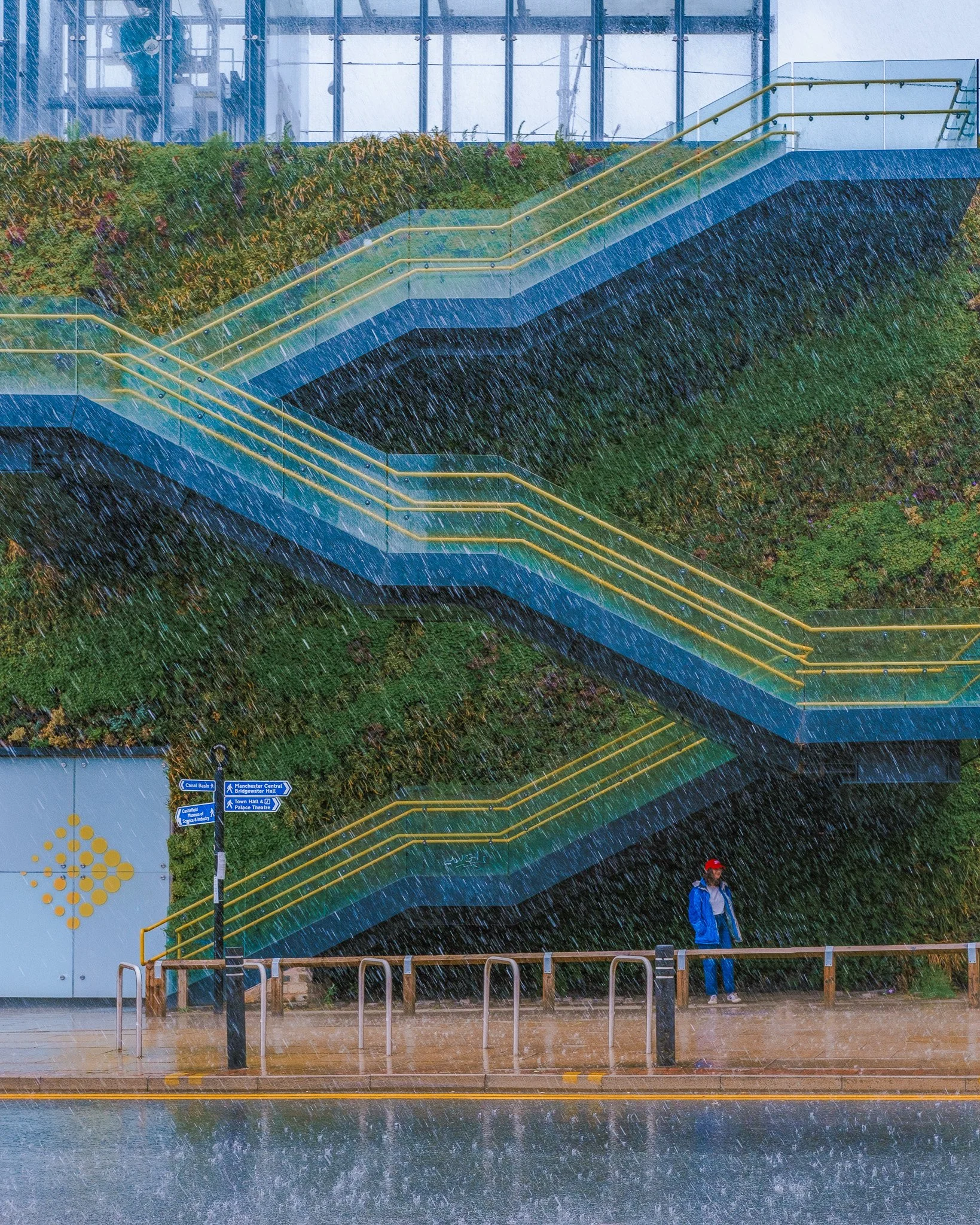
Post Waffle Article
Anyway, let’s get into it. I don’t want to dwell too much on myself or why I first wanted to learn more about colour—apart from a few small details that might resonate if you’ve hit some of the same bumps in the road I did.
Originally, I shot only in black and white because I couldn’t make my colour photos look good. Black and white felt simpler — mostly about contrast (and, at the time, cranking up the clarity slider, or so I thought) — whereas colour often felt trickier to handle.
Most of the photographers I looked up to were using the filter du jour about five or six years ago (maybe still today), the kind that left photos looking desaturated, with boosted orange or red tones, or some white balance trick to make everything lean monochromatic. Think The Matrix, where the whole world is green and certain colours are smothered—except, say, a red dress if required. I never really knew how to pull off those edits, and honestly, I’d recommend steering clear of them. Far better to take ownership of the natural colours in your photos.
I Wheely Like the Colour Wheel
You can do this by getting acquainted with the colour wheel. There are two main types most people come across: the RGB colour wheel and the painter’s colour wheel (RYB). The primaries differ slightly — and the layout of the wheel itself isn’t the same either.
Let’s get past the elephant in the room: the RGB wheel is absolute pants. Its biggest problem? It insists on featuring colours called cyan and magenta.
But who actually talks like that? A Man City supporter isn’t singing about a “Cyan Moon,” and when my little niece gets a new dress for Christmas, she doesn’t come running downstairs shouting, “Look at my magenta dress!” But I digress.
I think the colour combinations on the painter’s wheel feel more intuitive and show up more often in the real world. Take complementary colours, for example: red and green — as featured in every Christmas advert for the next few months. The RGB wheel, on the other hand, gives you red paired with a strange blue (maybe Cyan!), which just isn’t as pleasing.
But I jest — I learned both, and you should too. I’ll probably dip into examples from each wheel depending on what I can dig up from my archive; they’re pretty similar anyway. Just never forget: the RGB wheel is for computer nerds, and the painter’s wheel is for artists, like you and me.
The Brotherhood of Colours
You can use the wheel to see which colours “fit” together in a harmony — it’s really useful for designing colour schemes, decorating a house, putting together an outfit, or in photography. I’ve never bothered to learn them by heart; I think it’s enough to recognise them by sight — and you probably already do, at least to some extent.
Look at any logo on the high street and you’ll see these familiar pairings — blue and orange, yellow and purple, and so on. Really, it’s just about being aware of them when you’re taking photos and trying to harmonise the colours in your frame by adding or removing elements, just as you would with composition or light.
Primary Colours


These are the basic ingredients of the colour wheel and can be combined to create the secondary colours — Red, Green, Blue are primaries for the RGB wheel, and Red, Yellow, Blue for the painter’s wheel. Most people know them instinctively. Start with just two, keep a tight frame to show them off, and try to eliminate any colours that might clash.
Complementary Colours

These are colours that sit directly opposite each other on the colour wheel — total opposites that, when paired, somehow bring out the best in each other. Think of them as the odd couples of the colour world: constantly clashing, but somehow it works.
On the painter’s wheel, you’ve got your classic duos — red and green, blue and orange, yellow and purple. You’ll start seeing them everywhere once you know what to look for: Christmas adverts (red and green), sunsets (blue and orange), or someone with warm skin tones against a cool wall. That last one’s used constantly in film — the classic teal-and-orange pairing.
If you’re working digitally, the RGB wheel switches things up a bit: red and cyan, green and magenta, blue and yellow. It’s a bit more technical, but the principle remains the same — opposites attract.
In photography, these combos make the heart sing. They help your images pop without resorting to saturation overkill or abusing the contrast slider, and they help you control the mood and focus of your shot. Once you start noticing them, you’ll never unsee them.


Monochromatic

Just as the name suggests — super boring. Think orange and a slightly darker orange. You can probably achieve this look with an overly aggressive colour grade. I’ve never knowingly aimed for this combination in my photos, so I can’t really help you, unfortunately!
Analogous

These are the colours that sit side by side on the wheel — like blue, blue-green, and green. They’re harmonious, chill, and easy on the eyes. Perfect for photos where you want everything to feel cohesive, like a leafy street, a sunset, or any scene where one colour gently flows into the next.
Split Complementary

A mildly thrilling combination of colours here — a primary and two secondary colours. It’s a bit trickier to pull off than primary or complementary schemes, but it can give you a richer, more dynamic photo while still rewarding a disciplined frame to show them off properly. Think orange, green, and blue (examples below!). A good way to remember it: two similar colours and one contrasting one. So, green and blue are similar, with orange across from them — or red and orange with green opposite.


Triadic

I quite like this combination of colours — blue, pink, and yellow. I either seem to notice it everywhere, or it just resonates with me for some reason. As you can see, it’s made up of three colours evenly spaced around the wheel: one dominant colour and two supporting ones. Another example you might recognise if you own a printer is the triad of cyan, magenta, and yellow.


Tetradic

This is as rock and roll as we’re going to get — four colours! Two pairs of complementaries! Although it’s not exactly clear from the picture above (I think my colour wheel might be a bit dodgy), red, green, yellow, and blue make a great example. You’ll see this combination everywhere — toy shops, circuses, pie charts, the Google logo. Another common one is orange, purple, green, and blue.
You’ll be doing well if you can shoehorn these colours into a photo and have it actually mean something. Once you hit four strong colours, it’s pretty tough to keep them organised — more often than not, it just dissolves into colour soup. Still, it’s good to have goals, right?
Another problem with colour wheels is that, as with the example above, they’re good at showing the in-between shades — that green, for instance, is really more of a turquoise. But in reality, you might find that more absolute versions of a colour work better for you. There’s a bit more flexibility than the wheel suggests. Like anything in photography, these tools are just guidelines to work with.
Conclusion
Hope you’ve learned something from my colour ramblings. Having a basic awareness of these harmonies will definitely help your photography stand out — especially in street work. I’ll admit, I don’t stand around thinking, “Right, I’ll wait for this colour, and that’ll make it a tetradic street photo!” I just look for colourful scenes, and the rest tends to fall into place.
In researching this article, I discovered that some people online take colour theory very seriously — we’re talking full-on colour police levels of obsession. They speak to each other in hex codes and, I imagine, have very few friends. But in street photography, you just take what you can get, and more often than not, you’re dealing in absolutes.
If you really want to get into the weeds about shades and tones, save that for post-processing — that’s where you can fine-tune your colours. I think if you can get them close enough in-camera, then with a light touch in the edit (nothing too heavy), you can make everything look nicely harmonious. Have fun!