Colour or Black and White?

AKA more click bait….
I’m nothing if not self-aware—sometimes painfully so. So why am I jumping back into the fray with another weighty topic? It’s because I want to know what the answer is, if there even is one.
Do you shoot one or the other—specialise? Or do you try to have the best of both worlds? Jack of all trades, master of none. Or can one approach inform the other?
The truth is… or more accurately, my truth (mouth vomit, sorry—I loathe that phrase), and I feel like I have to apologise because, of course, in the real world there’s only one truth, not some individual-specific version. Or, to put it more grammatically pleasingly: my opinion. And I’ll try to outline that over the course of this blog.
A Bit of Backstory
First, a little about my street photography journey to put things into perspective.
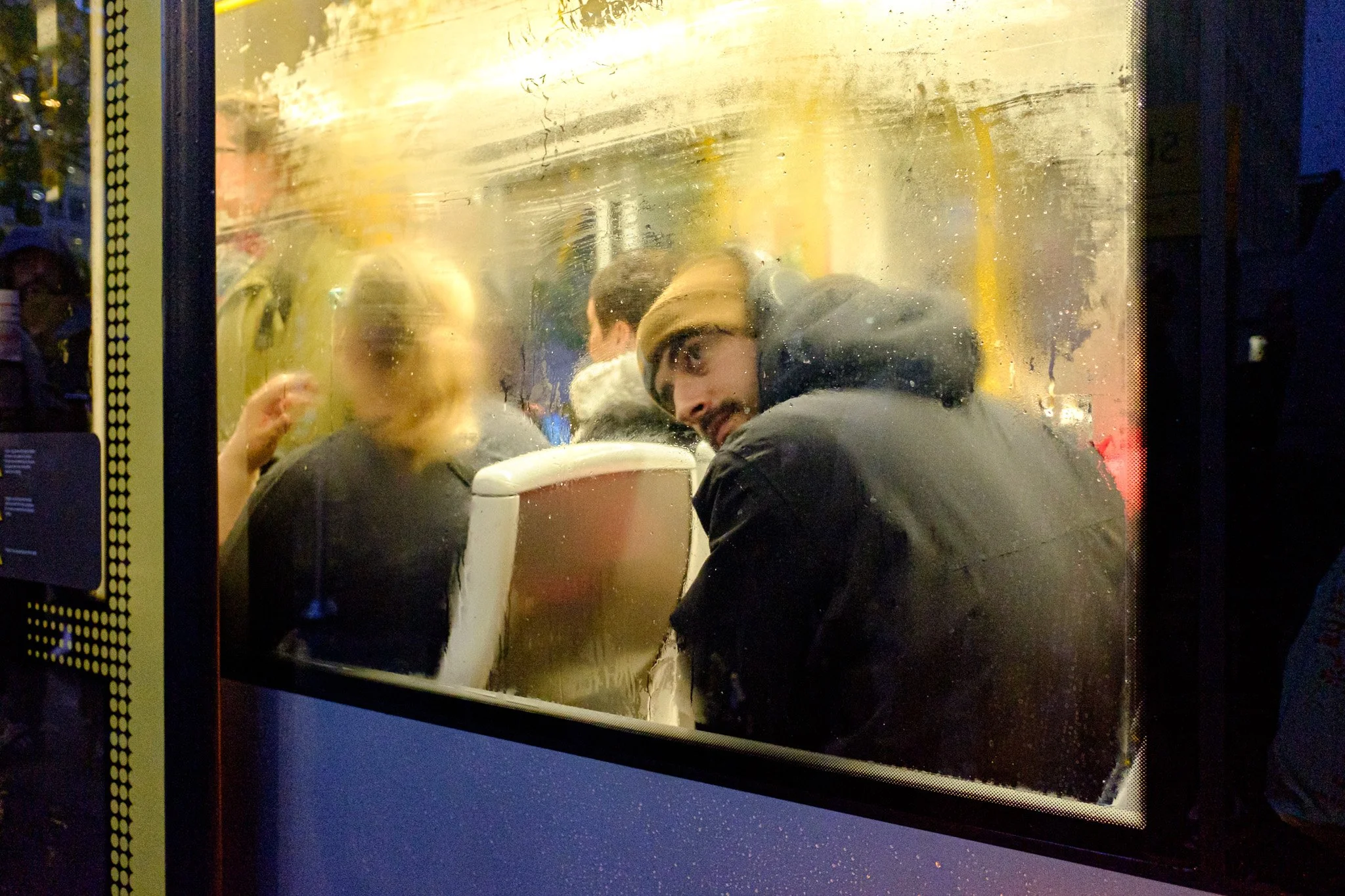
I started off doing close-up candid photographs of people and moments in Manchester, shot on my iPhone with its 28mm (or thereabouts) equivalent lens. They were always in black and white. I began posting on Instagram, joined photo groups, shot buildings, portraits—you name it. All the major genres.
I worked in both colour and black and white (usually with a heavy dose of the clarity slider—we were all young once). But I had a problem: I didn’t know how to edit colour and make it look good.
Quick sidebar: when I say “edit”, I mean post-process. Technically, that’s the correct term, but “edit” is quicker to type and say, so let’s roll with that. Right, flow now completely lost… like a WWF wrestler tag-teaming back in—here we go!
I couldn’t edit colour for shit.
The Colour Crisis
My black and white shots were high contrast, high clarity—easy stuff. But colour? That was harder. I watched videos, downloaded presets, took tips from others. But I ended up deeply dissatisfied with how my photos looked.
The trend back then was the desaturated look— a general lack of colour and an odd muddy look paired with certain colours sticking out; odd orangey-yellows and not much else. I tried to emulate it, but it never felt intuitive. Worse, I’d see these trendy photos on Instagram and they’d look “cool”… for about three seconds. Then they'd fall apart. All style, no substance. A veneer. The emperor’s new clothes.
Of course, not every photo was like that. But it frustrated me that something so shallow could be so successful. Still, I kept tinkering with presets, dissatisfied.

An example of a desaturated image popular on Instagram. Copyright shootstreetrepeat.com
Beer, Breadcrumbs & Bullshit
I remember going for a beer with a girl who was incredibly precious about her editing secrets—once claiming in a group chat that she’d take her presets to the grave.
So we’re about three beers into Happy Hour, things are loosening up, and I ask her how she gets her “look.” Still cloak-and-dagger, but she throws me a breadcrumb:
She edits her photos not for colour—but away from certain colours.
At the time, I thought it was profound. An epiphany.
Now? I think it’s garbage—at least if taken too literally. You're using editing software to remove colours, I’m not a fan of that, and her look ended up pretty adjacent to that same desaturated style I mentioned about, oh… a million years ago. I’m rambling, I know.
Anyway, I kept shooting around Manchester—rooftops, streets, recognisable spots. Basically, crowd-pleasing photos of famous landmarks for the people on Insta who lived in Manchester or had at one time. Low-hanging fruit, really. And I know plenty of folks have Manchester-style shots like this on their walls, which is all well and good.
Personally, though, when it comes to celebrating present-day Manchester with a framed photo hanging in the loo… I think it’s kind of lame. (At least buy a quirky painting—they’ve got way more character.) Maybe in 25 years, it’ll be cool—and finally earn a spot higher up the hanging hierarchy than the toilet wall.
Then one day, a friend told me bluntly that I was wasting my time with the “Manchester stuff” and I should focus on my street work, which she found far more compelling.
At first, I was slightly hurt by her comment—but only because she was right. I was doing the Manchester stuff to get featured by the big Instagram accounts. Full stop. And I wasn’t even that good at it. It was all ego—look at me, look at my city, please validate me.
So I dropped it and focused entirely on street. It felt like the right move. Plus, I was getting better—genuinely better. Street had a universality to it. Photos of people, real moments—they resonate, even inside a niche. The Manchester stuff? It had a ceiling. I could get technically slick at shooting architecture, shop fronts and landmarks, but who outside of Manchester would care? It didn’t scale.
So I made the switch. But what I didn’t see coming was how it would gut my Instagram momentum. That platform had been a drug—feedback, little dopamine hits, the illusion of progress. Back then, it even felt like a bit of a community.
And just like that, the features dried up. The likes slowed. The growth? Dead in the water.
Welcome to the Dunning-Kruger effect: when you’ve barely started a craft, get your ego stroked, and think you’ve cracked the code. Then the illusion shatters. I’d only been photographing for five minutes and thought I was hot shit.
Apropos of nothing, did I mention I’m a whore for Instagram? More on that in a future article.
The Fuji Revelation
The colour problem didn’t go away, but it got simpler.
One of the first photos taken with my new Fuji X70, Copyright shootstreetrepeat.com
I’d just bought a Fujifilm X70—one of the best happenstance purchases I’ve ever made (also, future article material). My photos started looking great straight out of camera (SOOC). I began shooting mostly in colour because the Fuji's rendering was so nice.
I hit the streets hard—too hard, in fact. The burnout didn’t come until much later (future article alert—sorry for all the fishing hooks, but my bounce rate’s at 80%. I need something to keep people around. I want you to like me—or at least trick the stats into making me think you do).
I wasn’t exactly “looking for a look”… but I wasn’t not looking, if you know what I mean.
One day, I bumped into a guy I knew—a really good street shooter. We had a brief chat where he mentioned he was studying the colour wheel and learning all sorts of interesting stuff about colour theory.
As I walked away, mentally replaying that chat, I got curious. I went home and started reading. I discovered how certain colours have relationships. Painters, designers, decorators—they all know this stuff.
And suddenly, I started seeing it everywhere.
Colour Everywhere
I wasn’t just training my eye—I was opening it. Colour was everywhere. It was both complicated and beautifully simple.
They say the job of a photographer is easy: you just have to know where to stand and when to press the shutter.
That’s such a disarmingly simple and deeply complex way to explain photography. One quote, distilled to its essence, intuitively understood by anyone who hears it. But you could meditate on it for hours—turn it over and over in your mind like a child playing with a bag of marbles. Rolling them between their fingers, laughing at how simple and complex and ultimately real the illusion is.
It’s just a glass ball with a bit of coloured stuff in it… isn’t it?
Anyway, where were we?
The shutter thing! Of course.
Colours were everywhere, and they were bending over backwards to work for me. People’s outfits matched, shop doors were coordinated, logos seamless, signs on point. All I had to do was be ready when the moment—and the colours—aligned.
That’s how I became “the colour guy” on Instagram.
Well, in my own small niche—my family, some kind friends, and a few nice strangers who’d occasionally comment on the colours in my garish photos (in return for likes on their own photos, of course—kidding!). They were garish. Kind of still are. I’m just living one day at a time.
But maybe I’ve become a prisoner to colour science, staring through the gaps in my rainbow-coloured bars, wondering if today a fellow prisoner might shank me with a rainbow-coloured shank and spill my rainbow-coloured blood… I’m starting to realise that sometimes I take photos just for the colour combinations, even when there’s no actual “moment” in them. That’s probably not a good thing.
Still, it’s my antidote to that old “edit away from colours” idea. I do the opposite—I include the right colours in the frame. If they’re strong enough, they drown out the undesirable ones. And if not? I turn it black and white. Ha!
And now we’re here—this question I keep circling. I say I won’t shoot black and white because I love colour. That’s true. But am I secretly afraid that switching to black and white will take me away from what I’m good at?
Like Superman trading in his powers to be with Lois Lane… will I become mortal? Will I become shit?
Or could I learn something that would inform my colour work?
Colour vs. Black and White?

Fan Ho - Balance, Copyright Fan Ho
Black and white compositions, I think, are the superpower of photography. Without colour, composition takes centre stage. I’m not talking about the Gildens or Moriyamas of the world—where the emotion or subject does the heavy lifting—but the fine art stuff. The light, line, shadow, shape stuff. The stuff that ends up on walls. Think Fan Ho’s elegant geometry, or Ray Metzker’s obsessive play with contrast and form—photographers who built worlds out of structure and silence.
Last winter, I tried switching my viewfinder to black and white—but I hated it. I’d spot a great colour scene, lift the camera to my eye, and instantly feel disoriented. The viewfinder wasn’t reflecting what I’d just seen with my own eyes. The moment would vanish. Scenes that looked vibrant in real life turned to mush because, out of habit, I was still shooting for colour.
So now I wonder: is there something lacking in my compositions because I never truly studied black and white?
Have I lacked the humility to step back and start again—just because I feel like I already “solved” colour? God, what bullshit. “Solved colour.” Enjoy that one. Sometimes I hate myself. But you know what I mean—I’d nurtured a skill. I think that’s fair. You can decide whether I deserve that… maybe by liking a few of my photos on Instagram.
Did I mention I’m a whore for Instagram?
The Great Deception…
So a few hundred words later I feel this article serves as a trojan horse, the horse is the click bait title and whats inside the horse is me bragging about being good at shooting in colour and telling you about my “journey” like you give a fuck or think I’m the main character.
But yet… here you are, Dear Reader (goes off to check bounce rate again)—and I’m glad. Still, I can’t keep running from the question: Colour or Black and White? Or… maybe I can. Because I don’t have the answer yet.
But I’ve been writing for too long, and have I even said anything? I don’t know. And you’ve read too much. If you’re even still here… well, bounce rate suggests probably not. If you are—thank you. And I’m going to take a risk: I’m calling this Part One.
All the answers to life’s questions—and especially this one—are in part 2. Yes! You can have the answers, my friend.
Just keep me company to the next bus stop, yeah? That way, I won’t have to travel alone for a little while longer.
Until then, keep shooting.